Energy Journey
Continue your Energy Journey and expand your system—e. g. with additional storage capacity, heating elements, heat pumps, wall boxes, and the corresponding Symphon-E Apps. You’ll get an overview of your Energy Journey so far, and you’ll also see the next steps for expanding your system in a meaningful way.
History of Your Energy Journey
The History submenu item displays graphical data for your system regarding:
⬤ Production, ⬤ Charging, ⬤ Discharging, ⬤ Grid feed-in, ⬤ Purchased from grid, ⬤ Consumption, ⬤ State of Charge (SoC, dashed line)
You can choose between the time periods Day, Week, Month, Year, and Total Period. You can also display a custom (different) time period. The values are displayed in kWh.
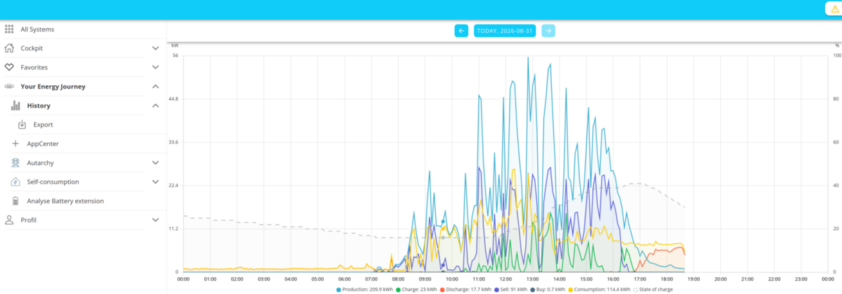
Clicking or tapping on the respective value in the legend hides or shows the corresponding graph.
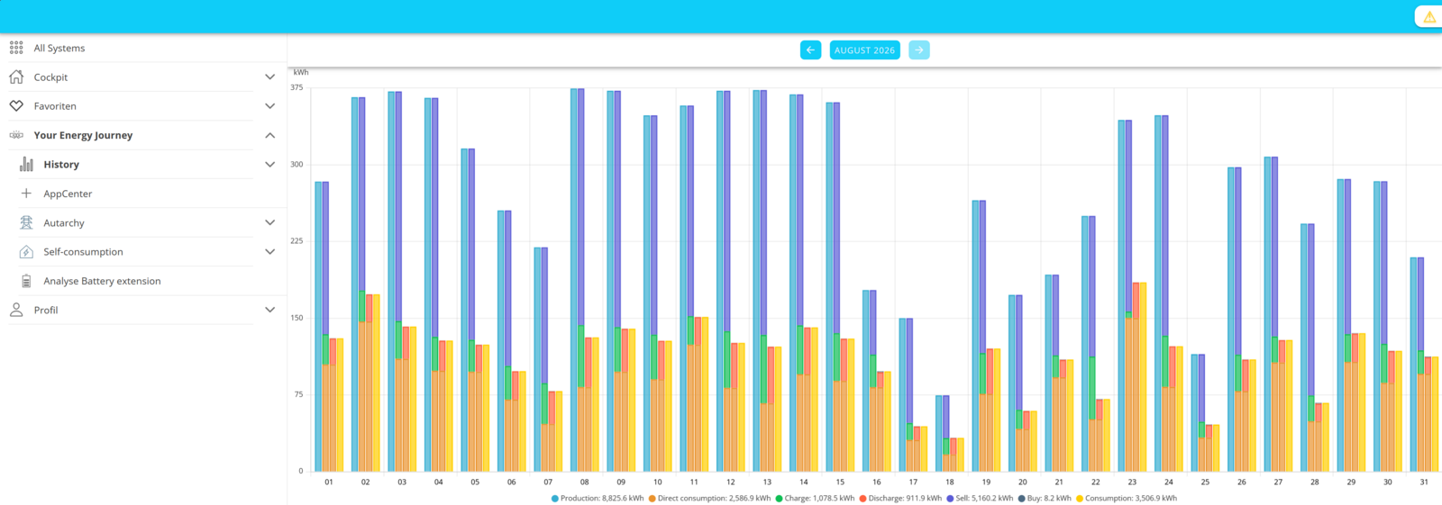
In the monthly and annual views, the State of Charge (SoC) of ⬤ is replaced by Direct Consumption ⬤ .
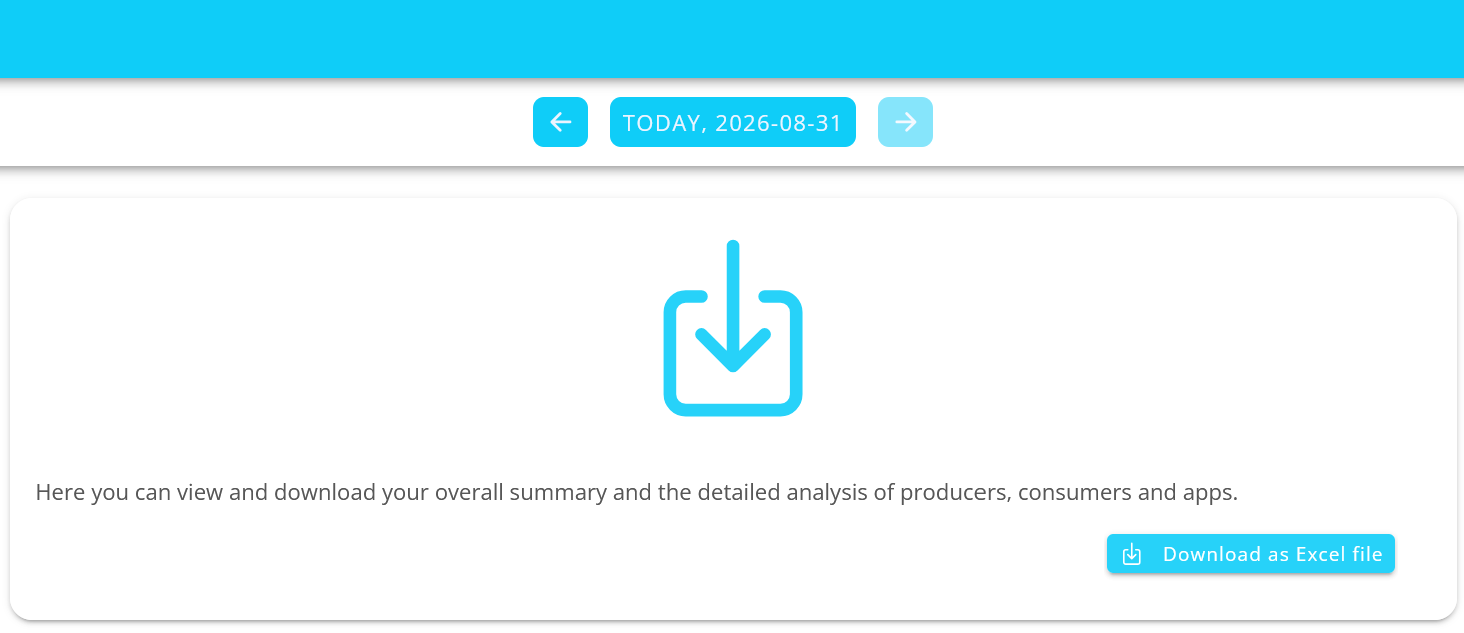
Select Export under the History menu item to export the values for the selected time period as an Excel file (.xlsx). By default, the file is located in your device’s Downloads folder. The file name includes the FEMS number and the time period for which the values were exported.
Symphon-E AppCenter
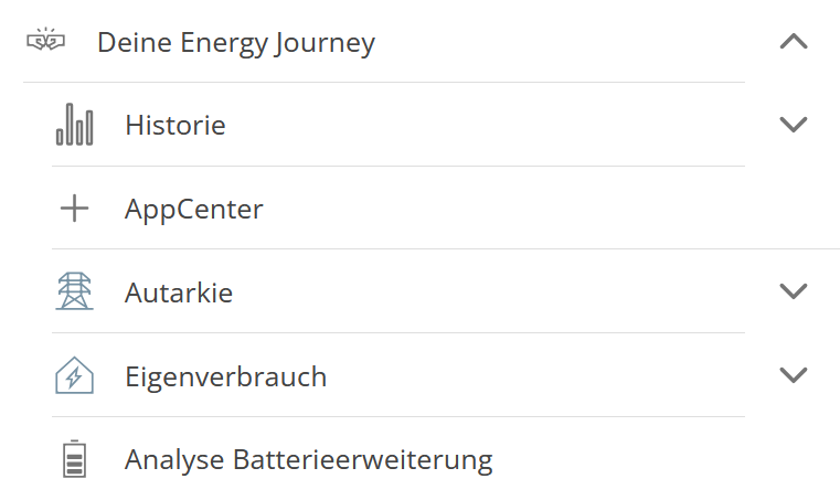
The AppCenter for registering, redeeming, and managing license keys can be found in the main menu under Your Energy Journey:
You will then see the AppCenter in the main window:
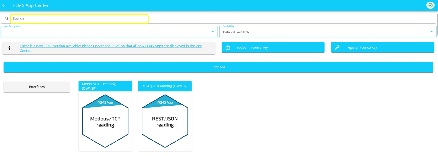
From there, you can continue with the AppCenter features.
Autarky
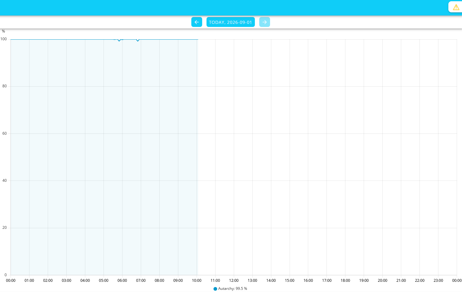
This main menu item is part of the Energy Journey and displays your self-sufficiency rate as a percentage. The autarky rate describes the proportion of your total energy consumption that is met by your own self-consumption. The higher the autarky rate, the less dependent you are on external energy sources.

You can also view an Autarky history. Here, you can choose between Day, Week, Month, Year, and the Total Period. You can also view a custom (different) time period.
Self-consumption
Self-consumption indicates the percentage of the power currently being produced that is consumed for direct consumption and for battery charging.

Self-consumption also has a historical view:
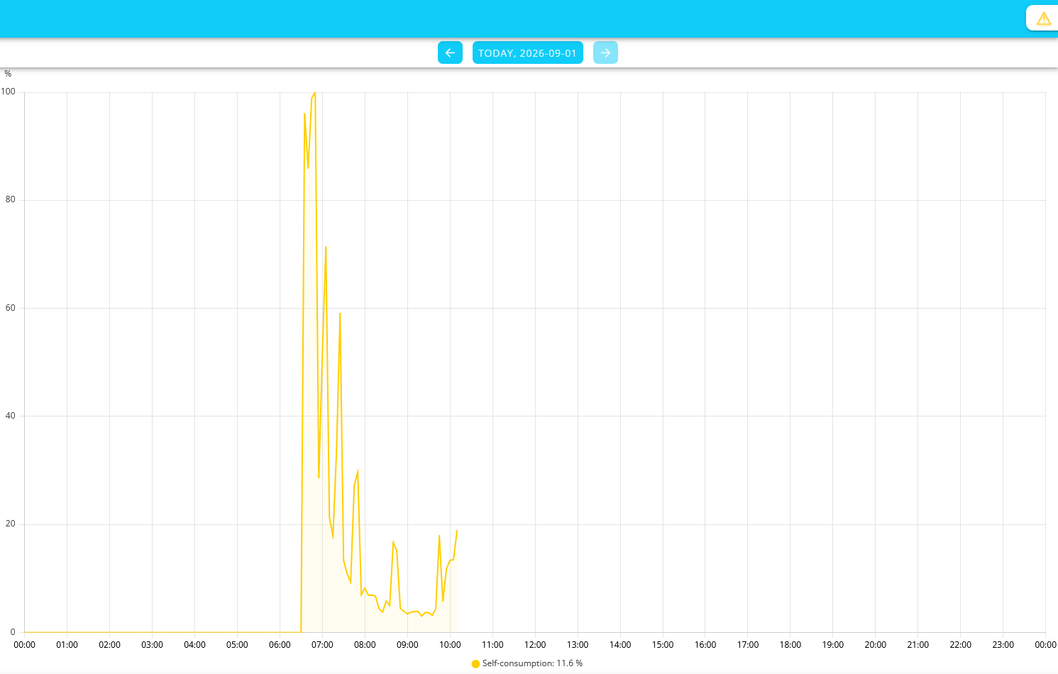
| If there was no production, there can be no self-consumption! Therefore, self-consumption is only shown in the chart if there was also production at that time. |
Analysis of Battery Expansion
The battery expansion analysis shows you how expanding your battery system would affect your energy self-sufficiency. You’ll receive step-by-step instructions and visualizations to help you find the optimal system configuration for your needs.
-
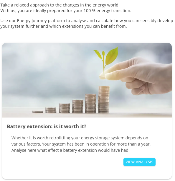
Start the analysis by clicking VIEW ANALYSIS.
-
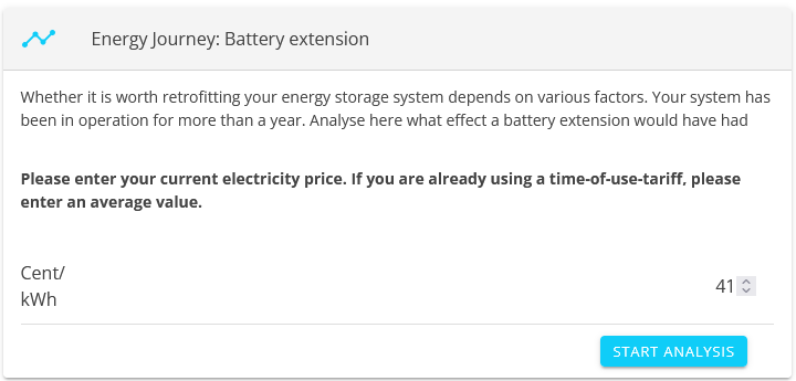
Enter your current electricity price in cents per kWh. If you have a time-of-use tariff, enter the average rate. Click the START ANALYSIS.
-
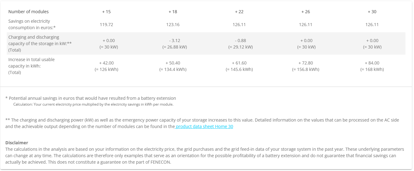
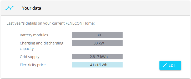
You will first receive information for the past year.
-
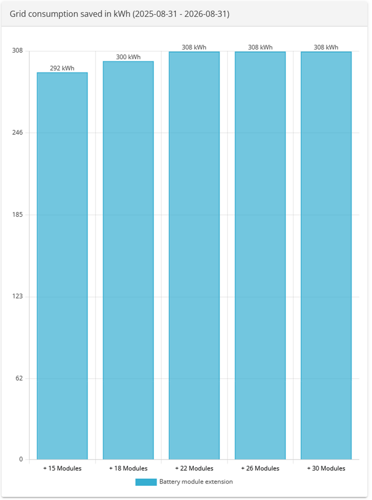
The bar chart below shows how many kWh you could have saved during this period with the corresponding battery upgrade.